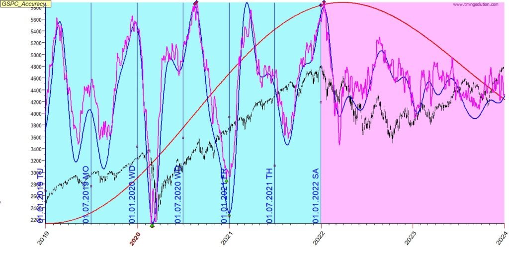
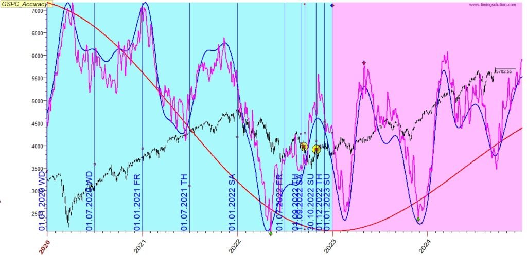
In this article we will present the analysis of the forecast algorithms on S&P500 (Ticker ^GSPC), on a period from 2018 to 2024, generating forecast each half a year, on January and on July for total of 14 forecasts. Each forecast presents the next 9 months ahead for regular presentation and in some cases also 2 years ahead for long term presentation.
The target is to check how each of the projection lines is forecasting the future, along a long period of 14 half years (7 years), their accuracy and consistency over time.
Each forecast includes the following projection lines, presented by a different color:
- Red – A few years cycle, long term trend
- Blue – a few months cycle
- Pink – a few days cycle
- Green – a detailed version of the pink algorithm
With the projection lines pictures you will find also some description of the meaning of the directions.
Summary of analysis
- The forecast algorithm present a very accurate and consistent projection for GSPC along the 7 years.
- There are only 4 places where the algorithm missed the direction:
- Forecast of July 2023, a month delay in forecast – Dec instead of Nov, partial correction by the green line.
- Forecast of Jan 2023, where one month May-Jun is inverse.
- Forecast of July 2022, from Aug/Sep 2022 to Nov 2022 (no inversion signals were detected), however, the forecast from Jan 2022 is correct, and the difference can be used as a warning signal.
- Forecast of July 2023, from Nov 2023 to Dec 2023. (The green projection lines provides partial correction).
- Forecast of Jan 2019 – miss of the bottom on June, potentially a temporary inverse case
- Roughly describing the missed directions of up to accumulated 3 months in 7 years is about ~3.5% (96.5% accuracy) for this case
- The Green algorithm added some minor information on top of the pink
- looking for cycles where the market is only trending and not cycling is a challenge (i.e. Jan 2021)
- The projection lines provided a good forecast sometimes up to 2 years ahead, as you can see in the examples ahead
Detailed Analysis
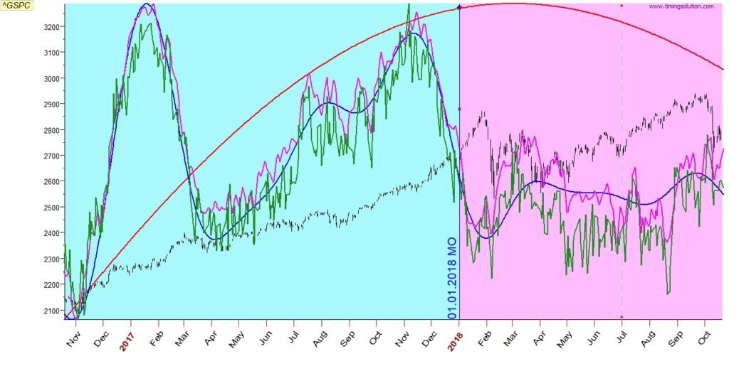
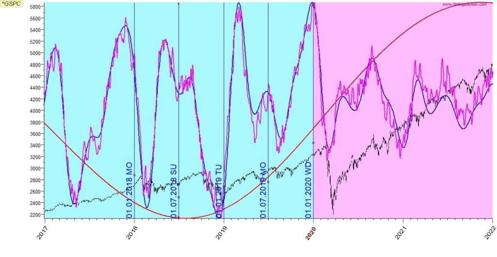
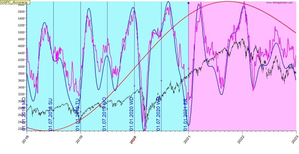
2018 Jan
Red line – indicates a change of pace from up to sideways.
Blue line – catches well the bottom on Feb and top in Sep.
Pink line – catches well the top in Jan, bottom in Feb, bottoms in Apr, May, top in Sep and bottom on Oct
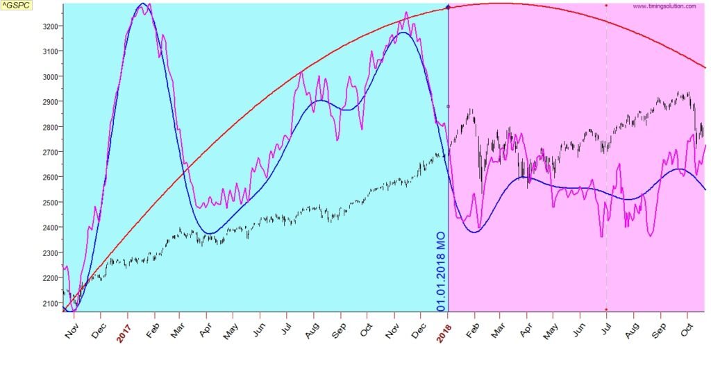
Adding the green line adds some minor information, in this case it is negligible
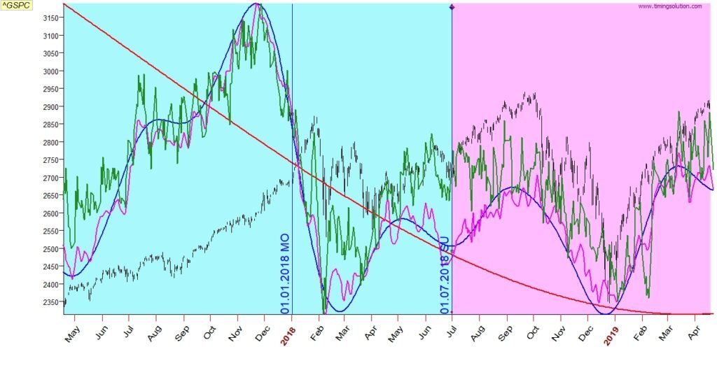
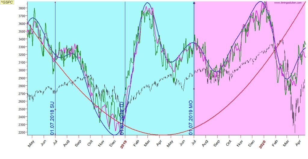
2018 July
Red line – indicates a downward direction which was caught very well
Blue line – catches well the top in Sep and bottom in Dec
Pink line – catches well the tops in Oct, Nov, and the bottoms on Dec, Mar
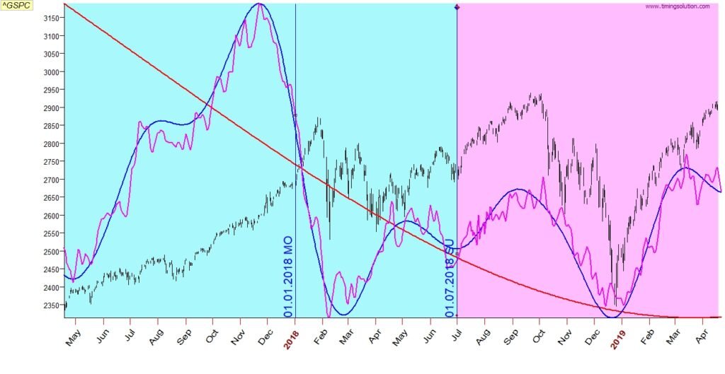
Adding the green line catches more tops and bottoms
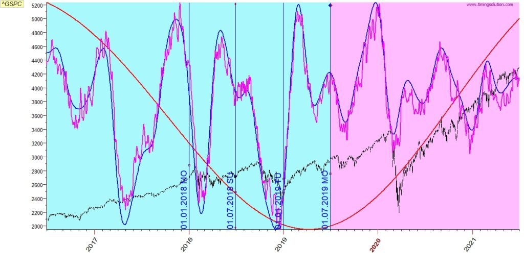
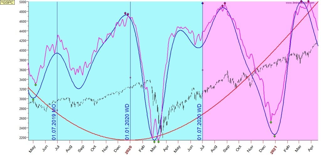
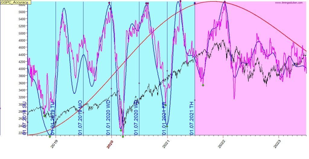
2019 Jan
Red line – indicates the continuation of a sideways in long term
Blue line – catches well the change of directions in Jan, June Aug – the “bend” in the line between Apr to Jul indicates a potential inverse case
Pink line – catches most of the changes but smooths the sharp changes
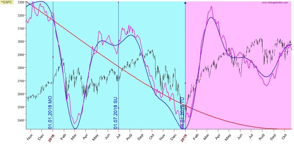
Adding the green line adds some more tops/bottoms but misses the bottom on June, probably due to the inverse case.
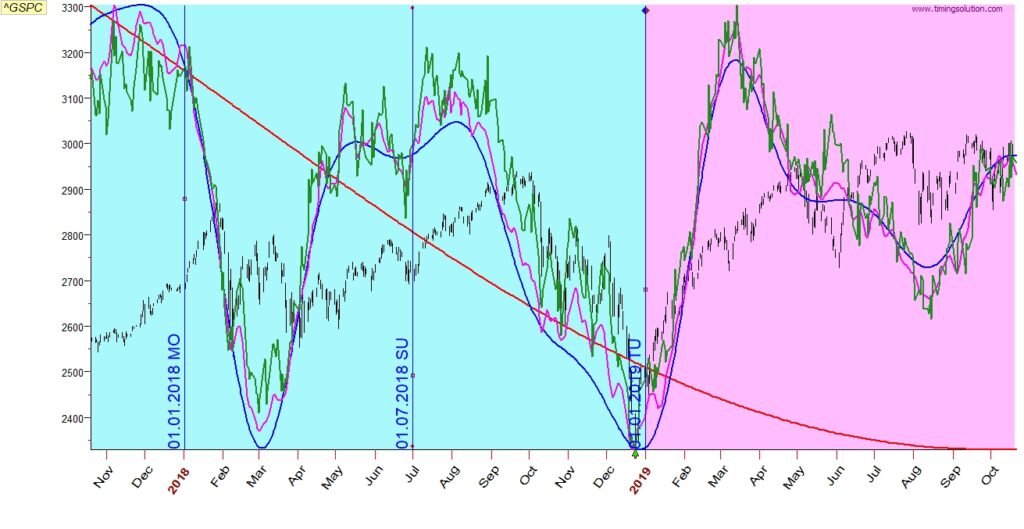
Long term view of this forecast shows a very good capture of the long term sideways direction and the bottom on Feb 2020
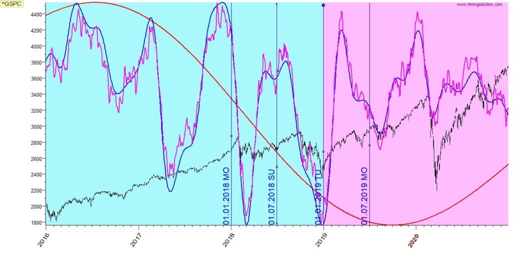
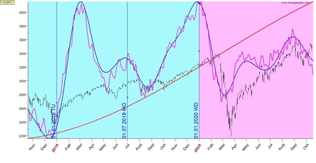
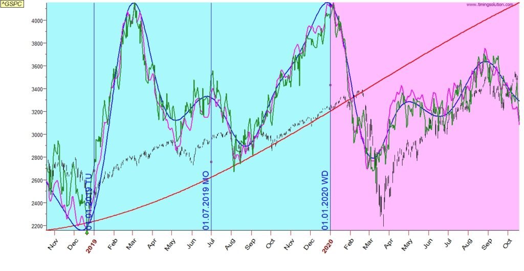
2019 July
Red line – Catches well the start of the long term uptrend
Blue line – catches well the change of direction on Sep and provides early notice for the change of direction on Feb
Pink line – catches well the bottoms on Sep and Feb/Mar
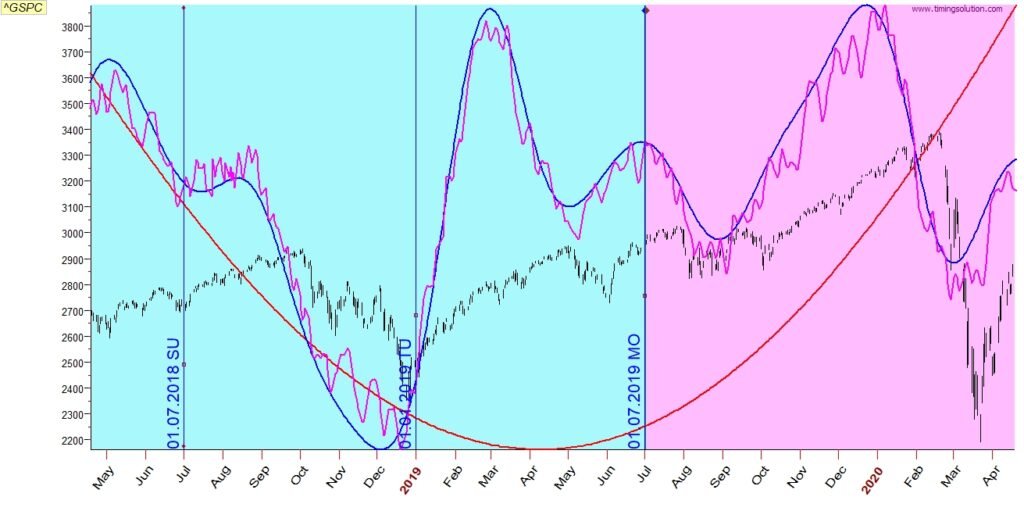
Adding the green line does not add much information in this case
Long term view of this forecast shows the good indication of the strong uptrend and the great catch of the Feb sudden drop and the immediate continuation of the uptrend.
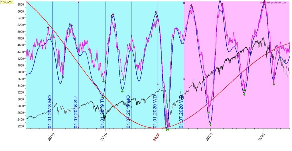
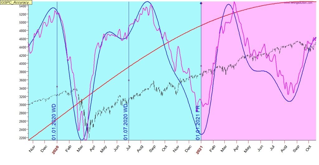
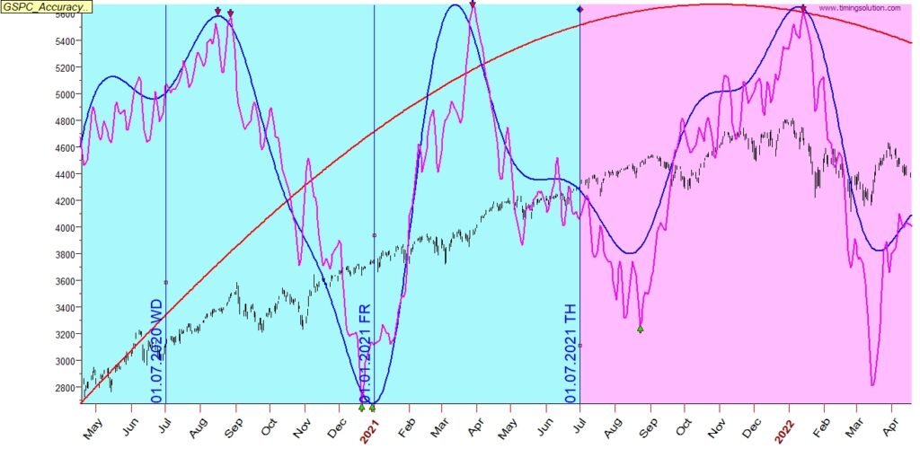
2020 Jan
Red line – captures well the strong long term uptrend
Blue line – captured well the change of direction in Jan, Mar and Sep
Pink line – captures most of the tops/bottoms along the blue line
Adding the green line adds more information such as the important top in Feb, bottom on Mar
Long term view of this forecast shows the great catch of the long term uptrend and the bottom on Mar 2020
2020 July
Red line – captured the strong long term uptrend
Blue line – captured well the change of trend on Sep (up to sideways) and on Dec (sideways to up)
Pink line – captured well the exact days of changes. A note here: in a tending only market, such as in this example, the algorithms are still looking for changes, sometime they may appear exaggerated as in this example
Long term view of this forecast shows very good catch of the long term trend with the change of direction at the end of 2021
2021 Jan
Red line – caught well the uptrend
Blue line – looking for cycles where the market is only trending and not cycling is a challenge
Pink line – looking for cycles where the market is only trending and not cycling is a challenge
Long term view of this forecast shows an excellent capture of the change in trend at the beginning of 2022
2021 July
Red line – captures well the change of direction on beginning of 2022
Blue line – caught the important changes of directions on Oct, Jan, Mar
Pink line – caught most of the dates of tops and bottoms
Adding the green line improves the prediction on all periods
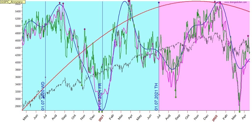
Long term view of this forecast shows an almost perfect fit
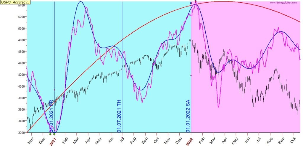
2022 Jan
Red line – captured the change of direction from up to down
Blue line – captured well the important dates of change of directions
Pink line – captured well most of the bottoms and tops
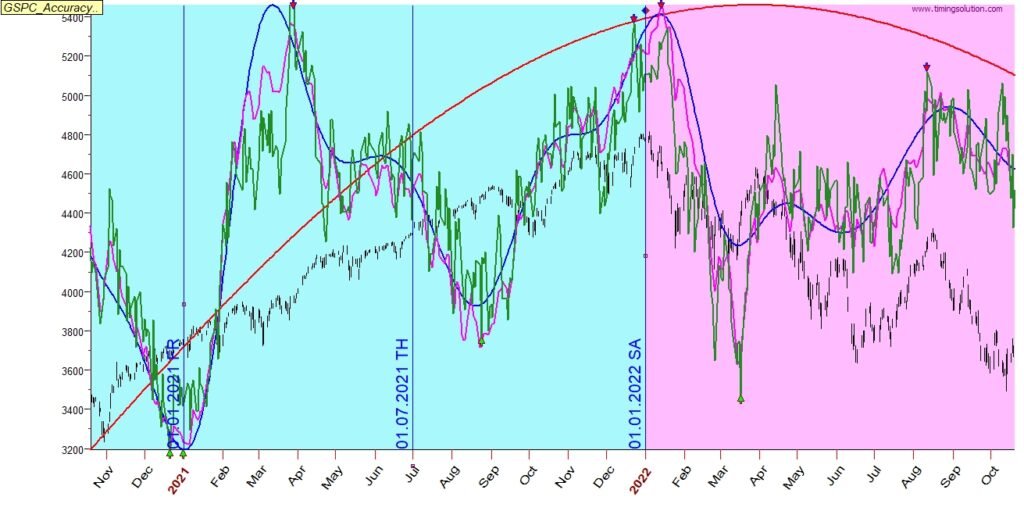
Adding the green line provides additional confidence to the dates indicated by the pink line
Long term view of this forecast shows an almost perfect fit
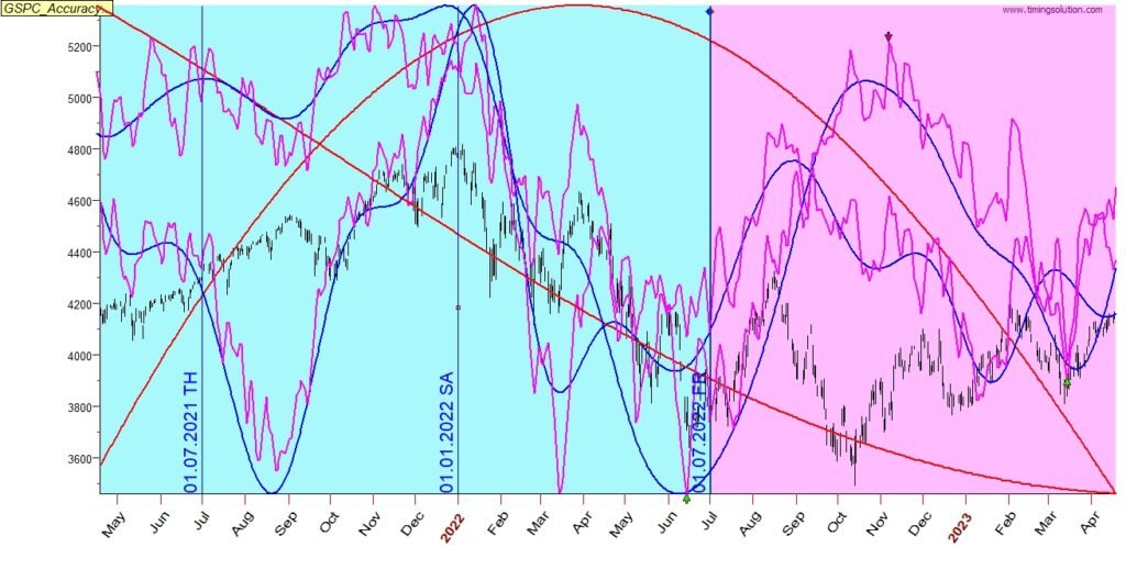
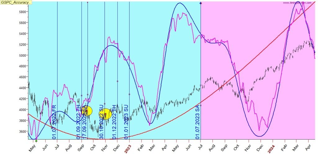
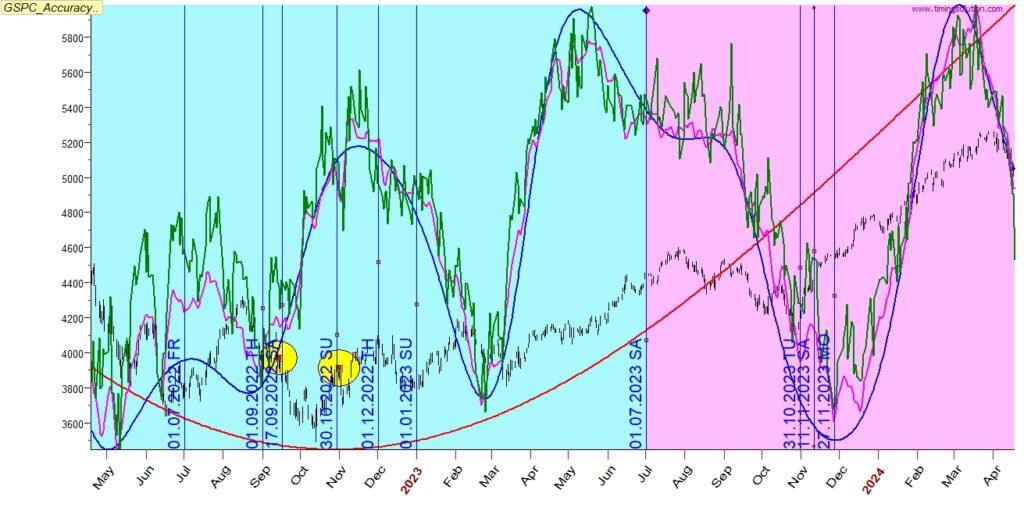
2022 July
Red line – captured the continuous down/sideways
Blue line – did not capture the price trend from Aug to Dec
Pink line – did not capture the price trend from Aug to Dec
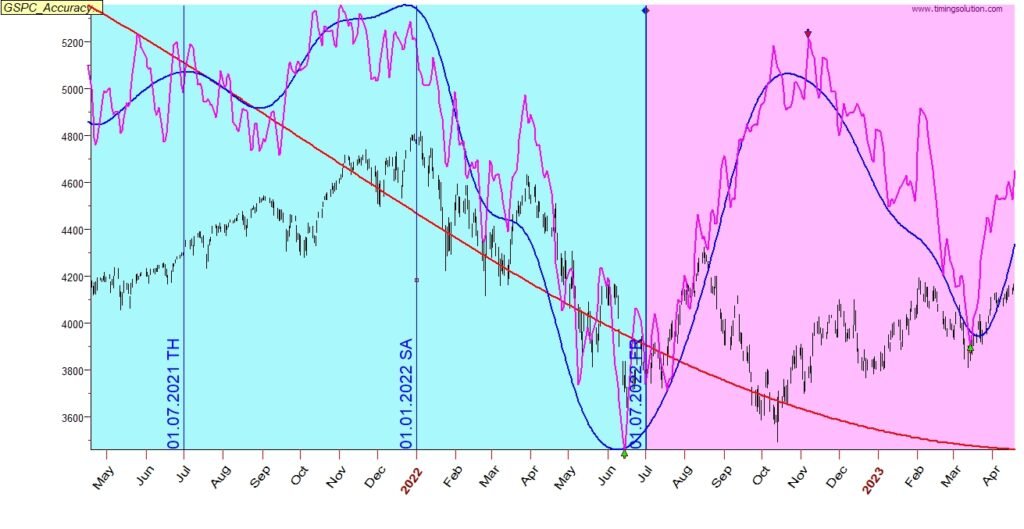
Comparing the forecast with the projection from Jan 2022 shows that the prediction from Jan 2022 is still valid, and the prediction from July 2022 differs
2023 Jan
Red line – captured the uptrend
Blue line – captured well the main dates of change of directions – missed May-Jun
Pink line – captured well the main dates of bottoms and tops- missed May-Jun
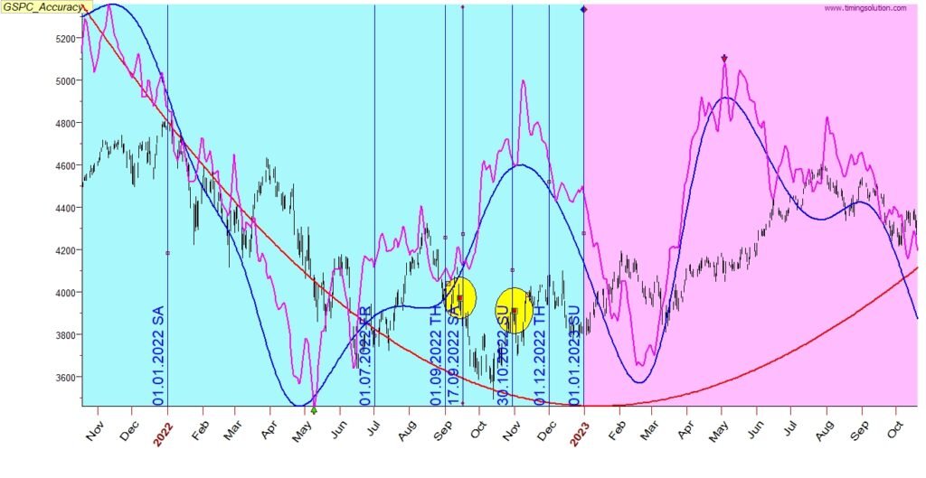
Adding the green line adds some minor information in addition to the pink line
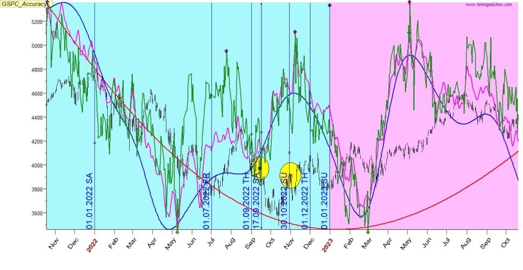
Long term view of this forecast shows a very good fit
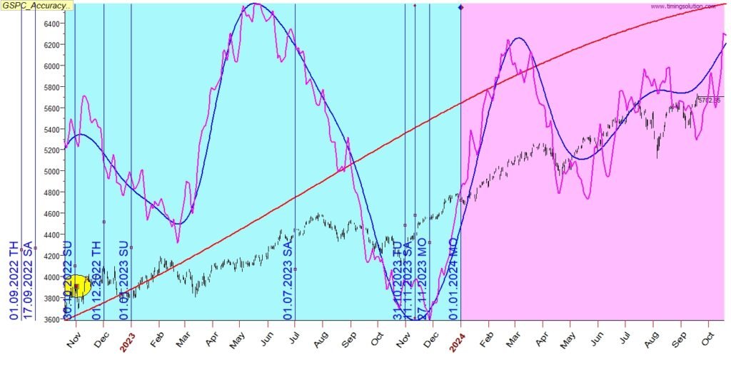
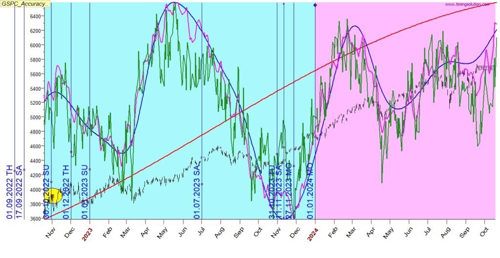
2023 July
Red line – captured well the strong uptrend
Blue line – captured well most of the periods of change of directions, missed the Nov (delayed to Dec)
Pink line – captured well most of the dates of bottoms/tops, missed the Nov (delayed to Dec)
Adding the green line provides an improvement on top of the pink line
2024
Red line – captured well the uptrend
Blue line – captured well the periods of change of directions
Pink line – captured well the dates of change of directions
Adding the green line provides specifics for the dates provided by the pink line
Thanks
Alon Avramson
24 Sep 2024